"downloading the internet"
hi! this article is aimed at folks who are interested in performance analysis or operations of software, and want to understand the impact on user experience. the examples will be centered around web applications and web services, but can be applied in other contexts as well.
in many ways, this is the information i wish i'd had available when starting out. when talking about performance, there are lots of technical terms like "latency", "percentile", "histogram". that can be quite intimidating at first.
the goal is to explain the motivation behind aggregating data in the context of performance, and provide an intuition for how to interpret those aggregated numbers.
latency is a measure of how "slow" something is. high latency means the system is taking a long time to respond. low latency means the responses are fast.
i am going to use the same definition of latency as gil tene [1]:
latency is the interval between two points in time. you measure the start time and the end time of an event, and you want to know how long it took.
depending on where that measurement was made, this is sometimes also called response time or service time.
a ⋯ b
→
t
you can describe this using seconds, minutes, and hours. for example: "i had to wait in the queue for half an hour, ughh".
in the context of computers you usually want to measure on a more granular scale, since computers are quite fast [2]. for web apps and web services, that is usually in the millisecond range. but you can also measure in microseconds or even nanoseconds [3].
a millisecond is a thousandth of a second. if your latency budget is one second, you have one thousand milliseconds to spend.
human reaction time is around ~215ms, though perceivable latency is much lower than that [26]. so for websites you generally want to optimize for ~300ms page load times or faster, and definitely under 1s.
sending packets over the internet takes some time, as transmission is limited by the speed of light [35][36]. this adds latency in the range of 100-200ms, depending on the location of the client and the server.
the main reason you should care about this is because of user experience. having to wait for things is often annoying. this includes waiting in the queue at the super market, waiting for food in a restaurant, or waiting for a website to load.
there are many studies that describe the impact latency has on business [4][24].
"downloading the internet"
so if latency is an interval in time, you can measure it via a clock. you take a measure at the beginning of an event, and at the end. by subtracting one time from the other, you get an interval. this is sometimes also called a "span".
most programming languages have constructs for getting the current time. this is often represented as a "unix timestamp", the number of seconds (or milliseconds) since january 1st, 1970. that will look like:
1514551903
"unix timestamp"
this time is sometimes referred to as "wall clock time".
in practice things get a bit more complicated though. from relativity to leap seconds, quartz oscillators, and synchronising clocks, dealing with time is very difficult [5][6][7][8].
the "current time" provided by apis usually defers to the operating system, which gets its time via the network time protocol. this can artificially slow down the clock or even jump back in time. for measuring latency, that is usually not what you want [9].
for this reason, many systems also expose a "monotonic clock", which does not have a meaningful absolute value, but has a more accurate relative notion of time [10]. while we'll probably want to use monotonic clocks whenever possible, wall clock time works ok most of the time.
the code for measuring latency in your programs will look something like this:
started_at = time_monotonic()

// code that does something, and takes some time

finished_at = time_monotonic()
duration = finished_at - started_at
to measure the latency of an entire incoming request, you can wrap that around the entire request/response lifecycle. in many cases, this can be accomplished through the use of middlewares or event listeners. adding code that tracks latency is often called "instrumentation".
those latencies can then be stored somewhere. most http servers can be configured to write latency numbers (response time or service time) to their logs. you can also send them to some dedicated metrics service, for example statsd [32].
for distributed applications it is often a good idea to measure latency from several perspectives. this usually means measuring on the server side and also on the client side. for the browser you can use the performance timing api.
let's say you have a popular website, and you want to understand the latency behaviour and its impact on user experience.
the raw request events from the access log will look something like this:
2017-12-29T14:06:03+00:00 method=GET path="/profile"  service=131ms status=200
2017-12-29T14:06:03+00:00 method=GET path="/"         service=34ms  status=200
2017-12-29T14:05:59+00:00 method=GET path="/main.css" service=18ms  status=304
2017-12-29T14:06:03+00:00 method=GET path="/"         service=32ms  status=200
2017-12-29T14:06:01+00:00 method=GET path="/"         service=44ms  status=200
you can extract the service times from this log:
131ms
34ms
18ms
32ms
44ms
depending on how much traffic (how many requests) this site gets, you could have very many of these latency numbers.
let's say you get 220 requests per second (req/s). that turns into 13k per minute, 790k per hour, 19 million per day. that's quite a lot of numbers to store and look at!
you can try to plot them. here is a chart of the latencies for 135k requests (production traffic) recorded over a 10 minute window:
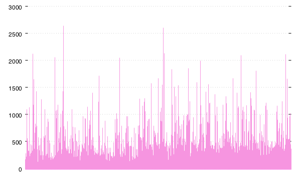
"raw events"
that chart is 600 pixels wide. which means there is not enough space to draw all 135k latencies. that means that some of the data is missing.
but even if you had a chart with all of the data, it would be quite difficult to read and interpret.
in practice you want to summarise or "aggregate" the data into fewer numbers that are easier to deal with.
aggregations are typically computed over a window of time. commonly 1 second or 10 seconds. that window or "interval" is called the "resolution".
at 220 req/s, a 10s aggregation will produce roughly one data point per 2k requests. for 10 minutes worth of data, the 135k requests were reduced down to 62 data points.
62 data points are much easier to look at than 135k.
one form of aggregation that you can perform is called the average. it is defined as sum divided by count.
if you plot the average of the raw events aggregated over 10 second intervals, you get something that looks like this:
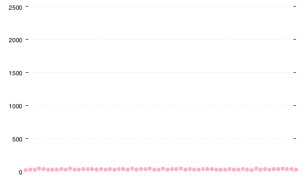
"average"
all of the data points are below 50 milliseconds.
this might lead you to believe that "most" responses are below 50ms, or that "most" users experience latencies below 50ms.
but looking at the raw events you can clearly see values up to 2500ms. so the average seems quite misleading.
it turns out that in the context of latency, the average is not a meaningful metric [1][11][12].
the average hides outliers (high latencies), which are the ones you are interested in. it under-estimates the actual user experience your users are getting. because it is computed numerically, the values do not correspond to any discrete latencies.
for these reasons using the average is generally discouraged. luckily, there are alternative aggregations that you can use.
a commonly used aggregation for latency data is the percentile or quantile.
its definition can seem a little obscure: the nth percentile is the value that n percent of all values were lower than. a different way of thinking about it is:
the 99th percentile latency is the worst latency that was observed by 99% of all requests. it is the maximum value if you ignore the top 1%.
a common notation for 99th percentile is "p99". the 99.9th percentile is "p999".
percentiles are useful because you can parameterise them to look at different slices in the distribution, and the higher percentiles will show you spikes in the raw data.
here is the p99 latency for the same 10 minute dataset:
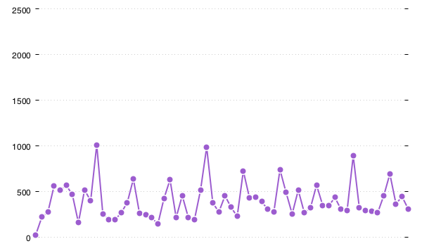
"p99"
this shows you spikes towards 1s. for web traffic this is often representative of what most users experience at some point during their session [13].
but p99 is still ignoring the worst 1% of requests. if you want to see the worst latencies, you can take a look at the p100 latency, often called the maxiumum or the max [14]:

"max"
this gives you a much more complete picture of the latency distribution. p99, p999, and max are usually good values to look at.
that said, interpreting percentiles is not the easiest, and can also be quite misleading at times.
one issue is that the raw data can change in volume, for example due to daily traffic peaks or other seasonality. this means that an increase in traffic volume can mask performance problems [15].
another issue is that once you have computed a percentile, you cannot roll it up or combine it with other percentiles. that is not valid math [16][17]. yet many metrics systems do just this, producing numbers that are no longer meaningful.
storing and computing percentiles is quite expensive.
but there is a data structure that can approximate percentiles, is very storage efficient, and allows results to be merged. that data structure is called a histogram.
a histogram is a representation of a distribution. it stores the range and count of values.
instead of storing raw values, a histogram creates bins (or buckets) and then sorts values into those buckets. it only stores the count of each bucket.
here is a histogram over a 10 second window of request data:
  0 -  50 [1620]: ∎∎∎∎∎∎∎∎∎∎∎∎∎∎∎∎∎∎∎∎∎∎∎∎∎∎∎∎∎∎∎∎∎∎∎∎∎∎ (74.55%)
 50 - 100 [ 447]: ∎∎∎∎∎∎∎∎∎∎ (20.57%)
100 - 150 [  49]: ∎ (2.25%)
150 - 200 [  15]:  (0.69%)
200 - 250 [  15]:  (0.69%)
250 - 300 [  10]:  (0.46%)
300 - 350 [   6]:  (0.28%)
350 - 400 [   1]:  (0.05%)
400 - 450 [   0]:  (0.00%)
450 - 500 [   4]:  (0.18%)
you can see that most requests are quite fast, 75% of all requests are under 50ms. the next 20% are under 100ms. and the remaining 5% are in the slower range.
this phenomenon is quite common in web latency data, it's called "tail latency". the high percentiles correspond to this tail [30]. and those are the slow requests that you usually are interested in optimising.
this pattern does not always hold though. latency distributions can vary quite a lot [18].
a nice property of histograms is that because they are based on counters, they can be merged by adding up the counters. you can merge histograms from different machines, or combine them in the time dimension (this is called a "roll-up").
histograms can be used to approximate percentiles. this is what prometheus does [19]. and there are data structures such as t-digest [20] and hdrhistogram [21] which can be used for this purpose.
another nice property is that you don't have to decide ahead of time which percentiles you want. since the histogram stores the full distribution, you can get any percentile out of it. though the sizing of the buckets will impact how precise the percentiles will be.
a latency heatmap is a way of visualizing histograms over time [22][37].
it visualises the full distribution by plotting time in the x-axis and latency buckets in the y-axis. the color of the bucket indicates how many values fell into that bucket. this conveys much more information than a single percentile would.
here is an interactive heatmap of the 10 minutes of request data, using 10s histograms:
each column of the heatmap corresponds to a histogram as seen in the previous section, flipped upside down. you can see the same pattern. many fast responses below 50ms, and some slow ones all the way up to 2s.
reading heatmaps requires some practice, but can provide a holistic view of latency behaviour.
you can either compute your histograms and percentiles in-process while you are measuring latency, or at some later time by processing logs. for in-process histograms, you might want to compute percentiles over 10 second windows.
that will require: a shared histogram data structure, the recording of latencies into this data structure, and a periodic percentile calculation. hdrhistogram [20] is an open-source implementation of such a data structure.
the shared data structure will have some code along these lines:
histogram = new_histogram()
every time you measure the duration of an event (e.g. via a monotonic clock), you can record it into the histogram.
histogram.record(duration)
now, every 10 seconds, a separate thread can compute percentiles to be reported to some sort of metrics storage, and reset the histogram to an empty state (or replace it with a new empty histogram).
stats = {
  p99:  histogram.percentile(99),
  p999: histogram.percentile(99.9),
  max:  histogram.percentile(100),
}
report(stats)

histogram.reset()
this reset is needed to ensure the histogram only represents the events that happened during the last 10 seconds, as opposed to all events since the process was started.
if the language runtime does not support shared data structures, or you want to aggregate across multiple hosts, you can use an aggregator, such as statsd [32].
computing and reporting percentiles this way is quite effective! and it will work with most metrics storage systems out there. there are some potential downsides to be aware of, though.
if you compute percentiles without retaining the histograms, you lose a lot of the flexibility that histograms afford (roll-ups, merging, computing any percentile, heatmaps). some metrics systems support storing histograms, and prometheus [19] is one of them.
another issue is that if you only have pre-aggregated data, correlating latency with events is impossible, which is often essential for debugging. one approach for dealing with that is logging raw events, potentially sampled [31][33].
now that you have the tools to describe latency, you can try to quantify the impact it has on the usability of your service.
when operating a service, you want to ensure the service remains usable. this is often called "availability", and has traditionally been called "uptime". a service is "available" when its users are able to use it.
however, a service usually cannot be characterised as "up" or "down", because it will always be in a partially degraded state. it will always be experiencing some errors, because software is imperfect. slow responses can also be described as a form of degraded service, and should be factored into the notion of "availability".
it's worth noting that some errors and some slow requests are ok! achieving 100% availability is not realistic.
availability is often described in terms of percentages, for example 99%. this can be a percentage of time or a percentage of requests. requests are usually easier to measure in practice, especially because services are often only unavailable for a subset of users.
availability percentages are sometimes also referred to as "nines", where 99% is "two nines", 99.9% is "three nines", 99.99% is "four nines", and so on [23][25]. each additional "nine" that you target reduces your error budget by a factor of 10.
variable latencies can cause more issues than just user-visible slowness. they can impact the overall stability of your system. these cascading effects mean that improving performance can really pay off [27][28][29][38][39].
if we're going to consider "slow" requests as part of your availability targets, you need to define what you consider "slow", and set explicit goals. such goals are sometimes called "service level objectives" [23].
a service level objective is about quality of service. it is a way of explicitly defining how much latency you (and your users) are willing to tolerate.
these objectives can be implemented as alerting rules over metrics, so that you can get notified when the service is degraded, and investigate [34].
one way to define such an objective is in terms of percentiles. for example: "the p99 latency, aggregated over 10 second intervals, should not go above 500ms for longer than 20 seconds."
however, one downside of that approach is that for such short 10s windows, the amount of traffic during the window skews the number. many fast requests can drown out the slow ones. an alternative is to measure across an entire day, or month, based on projected traffic [15].
to do this, you can define a cut-off latency of (for example) 500ms, and then measure how many requests exceeded that value. you can think of this as a "latency error budget". 1% of your (projected) traffic is the amount of "slow" requests that you can spend.
histograms are a good fit for this, since they store counts into buckets. you need to make sure your bucket boundaries are close to the cut-off though.
a weighted version of this calculation also exists under the term "apdex" [40].
phew, that was quite a lot to take in.
we've only scratched the surface, but i hope this has given you some concepts and terminology that you can use to charactarise the performance of your applications.
while most of the examples were based on web requests, the same principles apply in many contexts, from browsers to database queries, batch jobs, outgoing rpc calls, and waiting in line at the grocery store.
remember, at the end of the day, this is all about user experience and building things that people enjoy using.
a huge thanks goes out to margaret staples, anthony ferrara, and stefanie schirmer for reviewing earlier drafts of this work!
brought to you by @igorwhilefalse